Slack
Designing and building Slack’s interactive demo experience
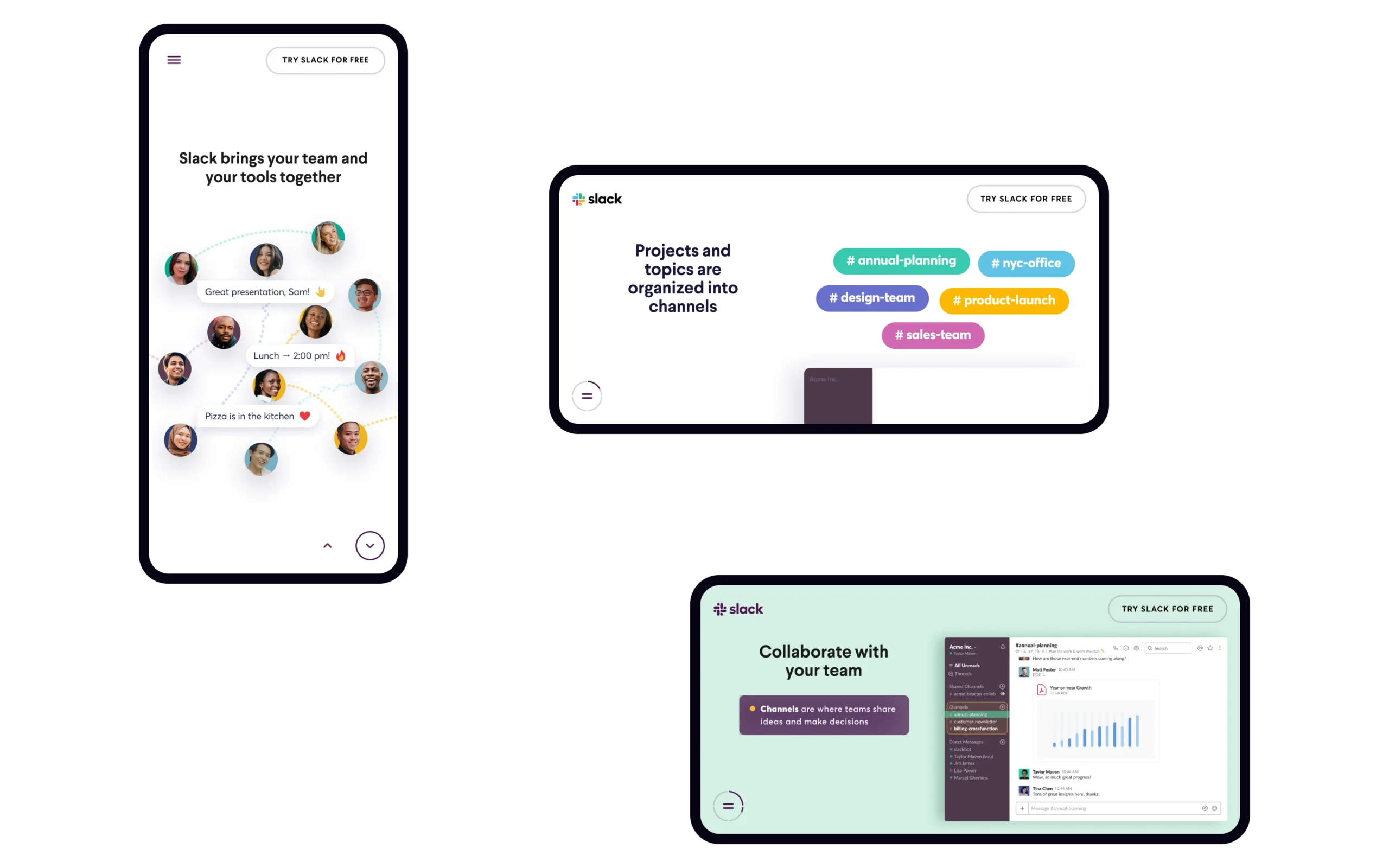
We partnered with Slack to build an interactive demo of their communications-centered product, showcasing its benefits while educating prospective enterprise buyers.
The demo is Slack’s primary sales tool to connect with new users.
/ Audience Appeal
Our challenge was to design the demo in a way that would engage three completely different audiences. These audiences include individuals who are not familiar with Slack, users who aren’t aware of all the product’s features, and business leaders who are seeking a resource to improve company communication and collaboration.
/ Intuitive Design
We created an efficient and understandable onboarding process to allow users to easily navigate the product.
/ Optimized for Every Screen
We paid special attention to breakpoints and screen resizing throughout the design and development process, ensuring users would be able to access the content no matter where or how.


